I am very fortunate to share an office with an awesome group of guys. Our office is known as ‘The Cave’ for the simple reason it is located deep in the dingy basement of the psychology building, down the hall from where experimental ‘participants’ are kept. We all realise the importance of enjoying the environment you work in (even a psychology basement) and have created the concept of office ‘vibe’, which simply aims to increase the inhabitants’ satisfaction with their working environment. When you walk into The Cave you can tell the place has vibe. Office members should aim to uphold vibe and never quash it.
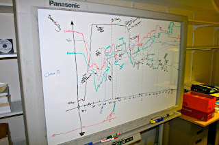
The Cave inherited an old whiteboard that was just taking up space. Clinton, senior Cave inhabitant, remembered what an old designer friend had done with their disused whiteboard, and so the Sensibility Graph was introduced. Sensibility is a measure of how sensible someone is, or of how much sense they are making. The graph is quite simple, each office member is represented by a different coloured line. Time, in days, is along the x-axis and sensibility is along the y-axis, so the higher on the graph someone
is, the more sensible they are.
A future project of our pre-pub Friday afternoon festivities (known as Crafternoon) will be to work on the Sensibility Graph and the measure of sensibility so that is scientifically sound. Perhaps the most exciting idea will be assigning values to the graph (why didn’t this occur to us earlier?) and statistically testing people’s sensibility. We could ask questions like:
- Are people more/less sensible on a Monday compared to other days?
- Is one person more/less sensible that others?
- Do large-scale meetings have a positive or negative effect on sensibility?

Are you studying Psychology@UQ and want to contribute to theuqpsycblog??
Send Will an email to find out how: will.harrison@uqconnect.edu.au


lol, can i see this graph??
ReplyDelete